
Publicity
Here you will find everything you need to use the Klaipėda Open Youth Center logo correctly: a logo usage guide and ready-made social media templates. The material is intended for the center's employees, partners, and the media.
If you are in doubt whether a particular solution is appropriate, write info@klaipedosajc.lt – we will coordinate.
Guide to using the mark
A complete brand description: logo, colors, fonts, photo style, social media, and other elements.
The most important rules
A brief summary. More details in the manual.
Logo
- On blue and green backgrounds – white logo, on yellow – blue, on white – blue or black.
- The smallest width in digital space is 120px (full version) or 100px (short version of „Klaipėda AJC“).
- A safety zone is left around the logo – no smaller than the height of the letter K in the word „Klaipėda“.
- You cannot change colors, proportions, composition or font, rotate, stretch or use effects.
- The logo is not repeated in the same layout and is placed on one of the edges.
Colors
Klaipėda city identity palette #5 is used:
- Sea: #1EA0DC, #32BBE9, #5BC9ED, #84D6F2
- Shore: #FFEB94, #FFDE45
- Continent: #67C599, #35B177, #029E55, #027740
Different color palettes cannot be mixed together.
Fonts and text
- Main font – Plus Jakarta Sans. When it is not available, it is used Arial.
- No more than 3 font sizes in one image.
- At least one intermediate thickness is left between font weights (e.g. Medium → Bold).
- The main text color is AJC blue. When it does not provide sufficient contrast, it is used white or black.
- Text on photos is placed in color blocks - this way it remains readable.
Photos
- Authentic, alive, youthful. The most important thing is real emotions, human connection and movement.
- Overly staged, formal, or promotional shots are avoided.
- Looking at the camera is not necessary.
- The environment acts as a context, not the main object.
Graphic elements (offsets)
- Color area offsets are an important part of graphic language. Within a single element, all offsets must be the same size.
- It is recommended to use no more than 5 offsets.
- The areas are composed horizontally or vertically, maintaining the established color sequence.
Social media templates
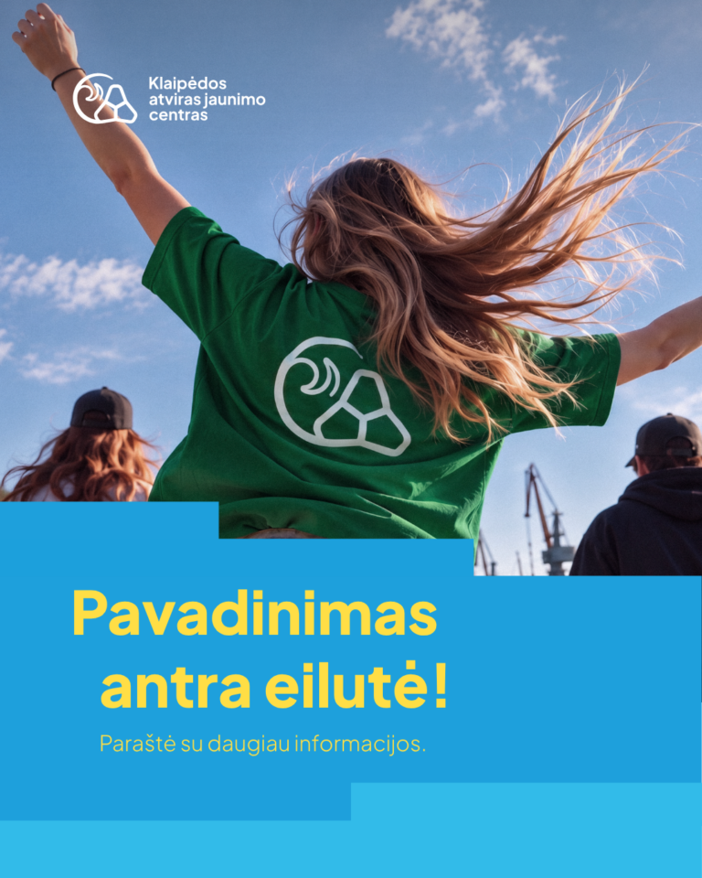
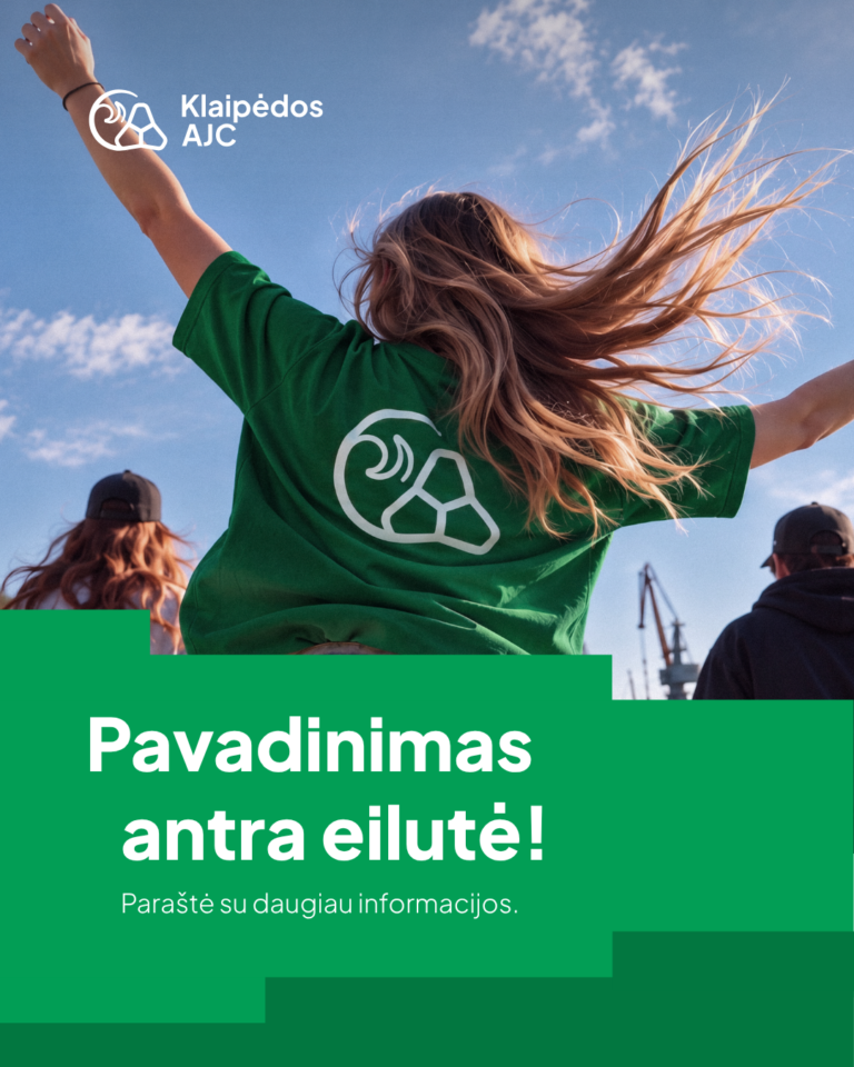
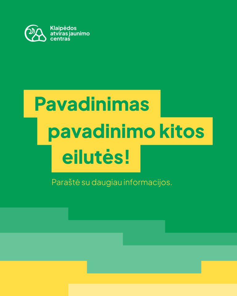
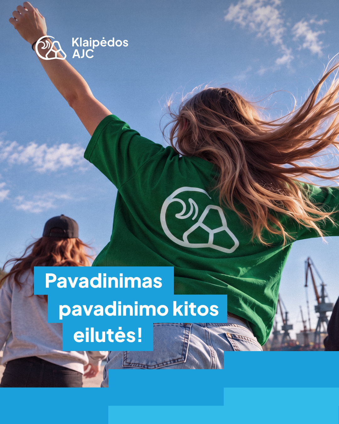
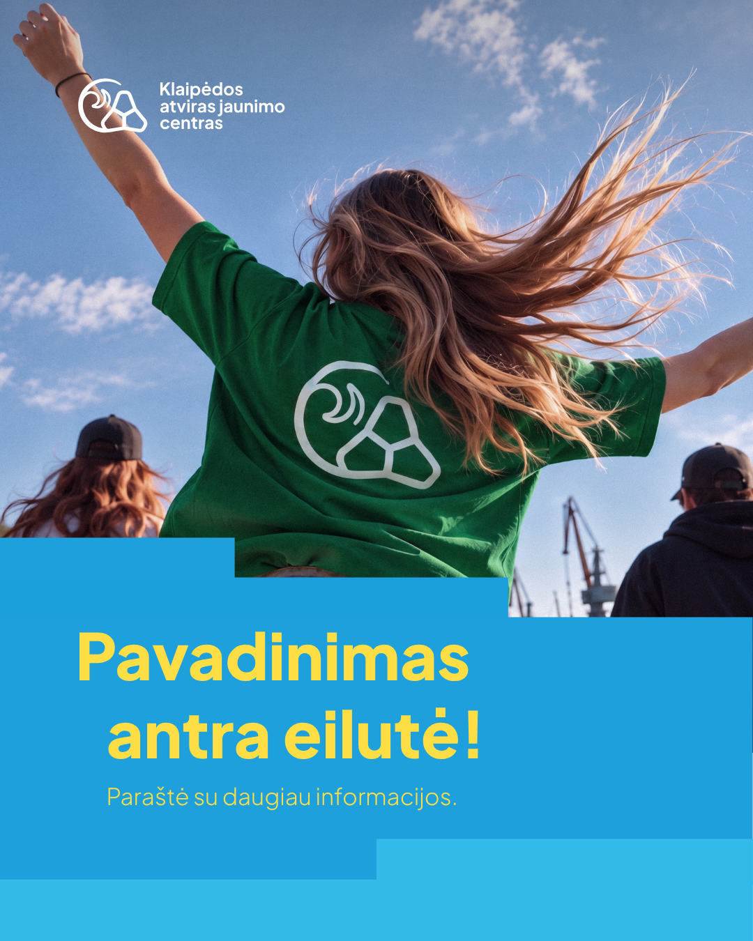
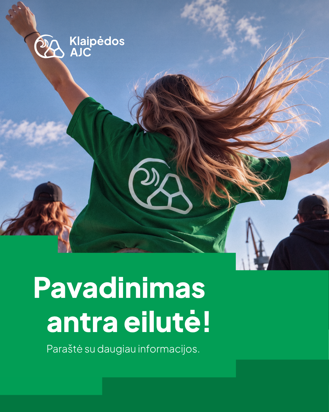
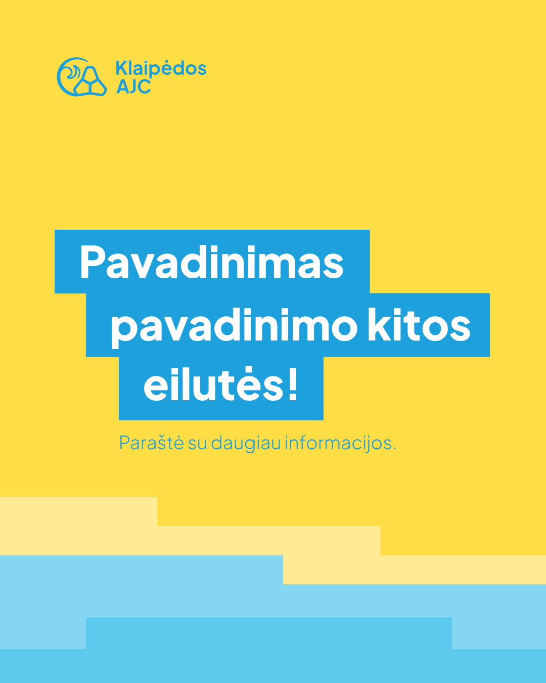
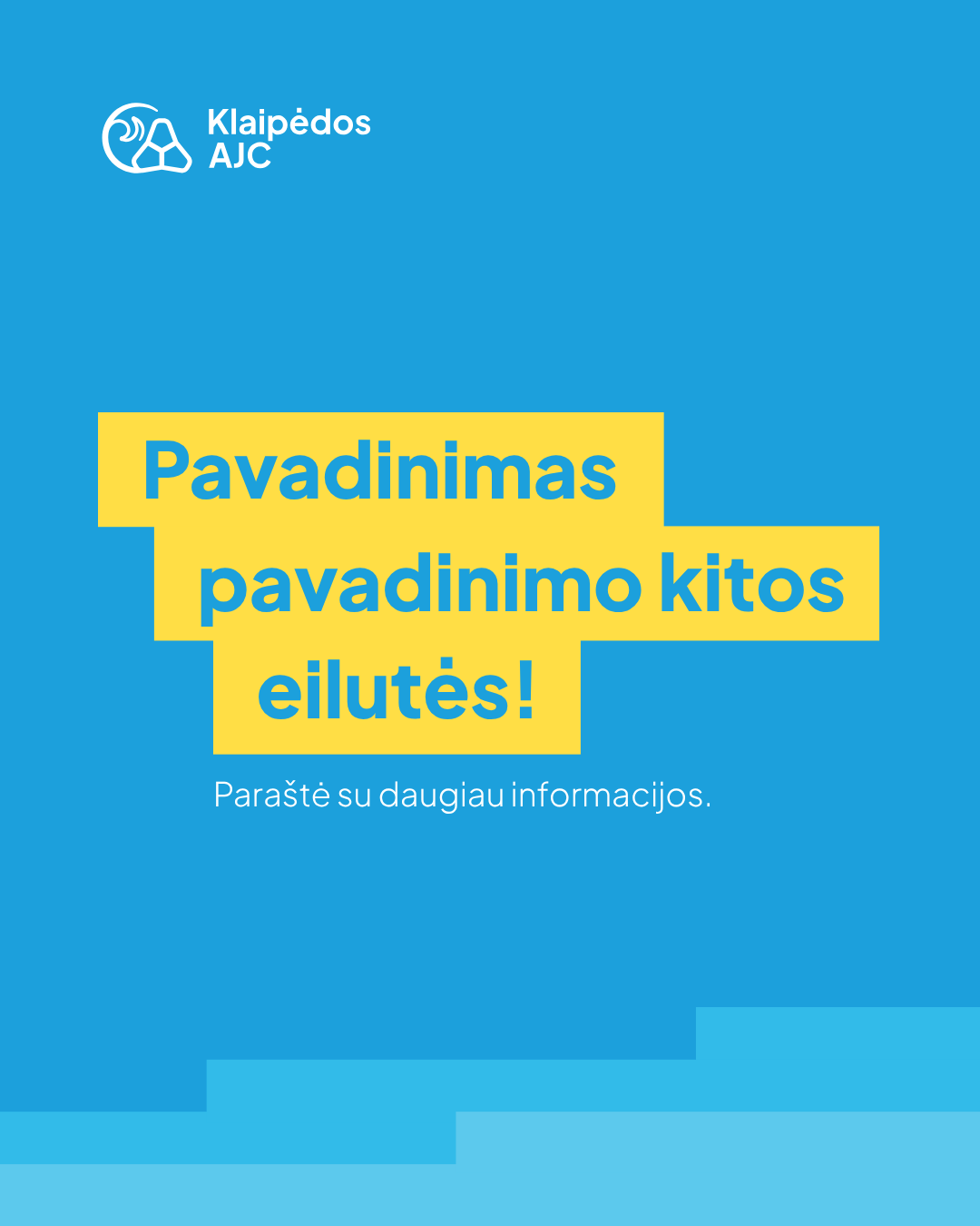
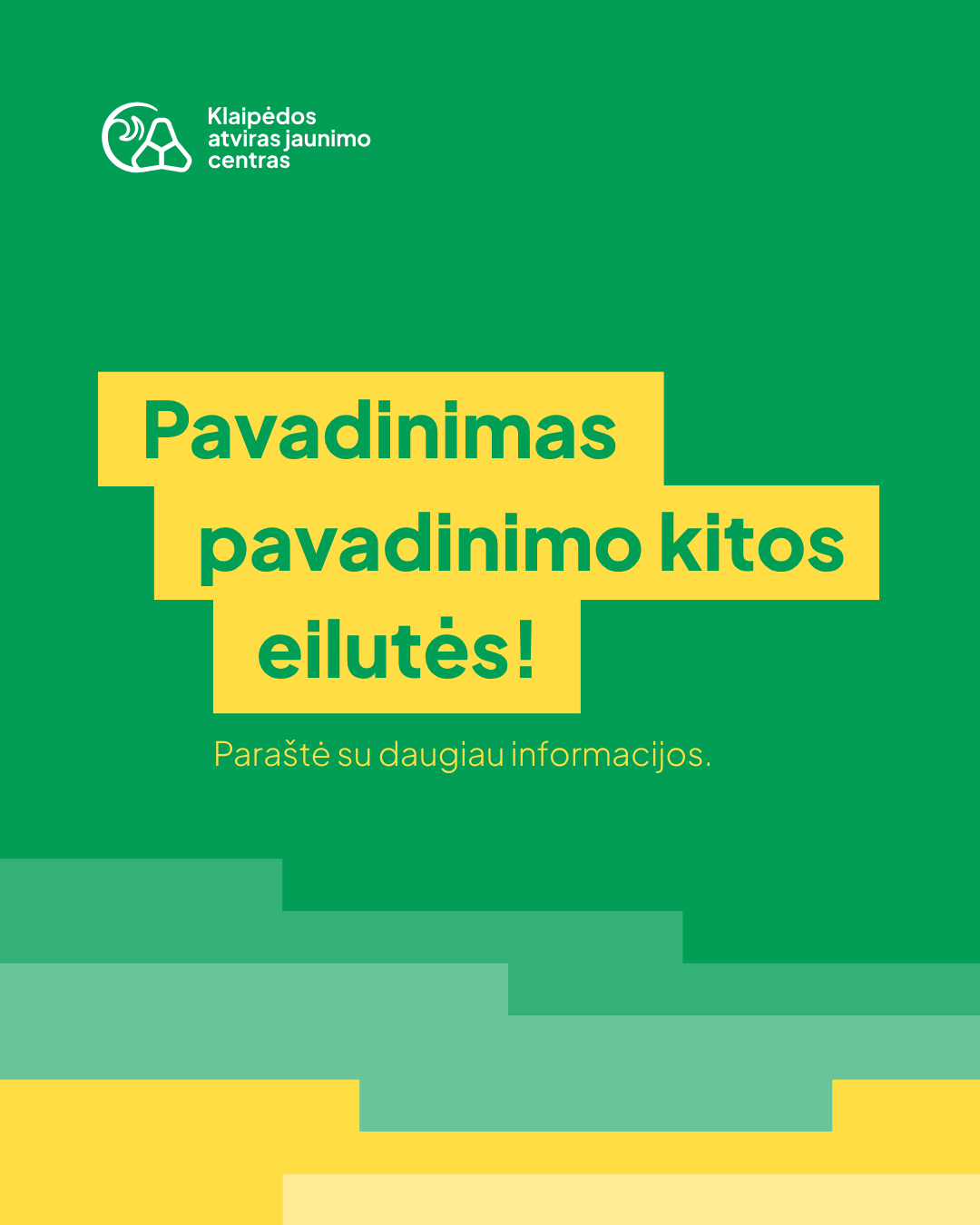
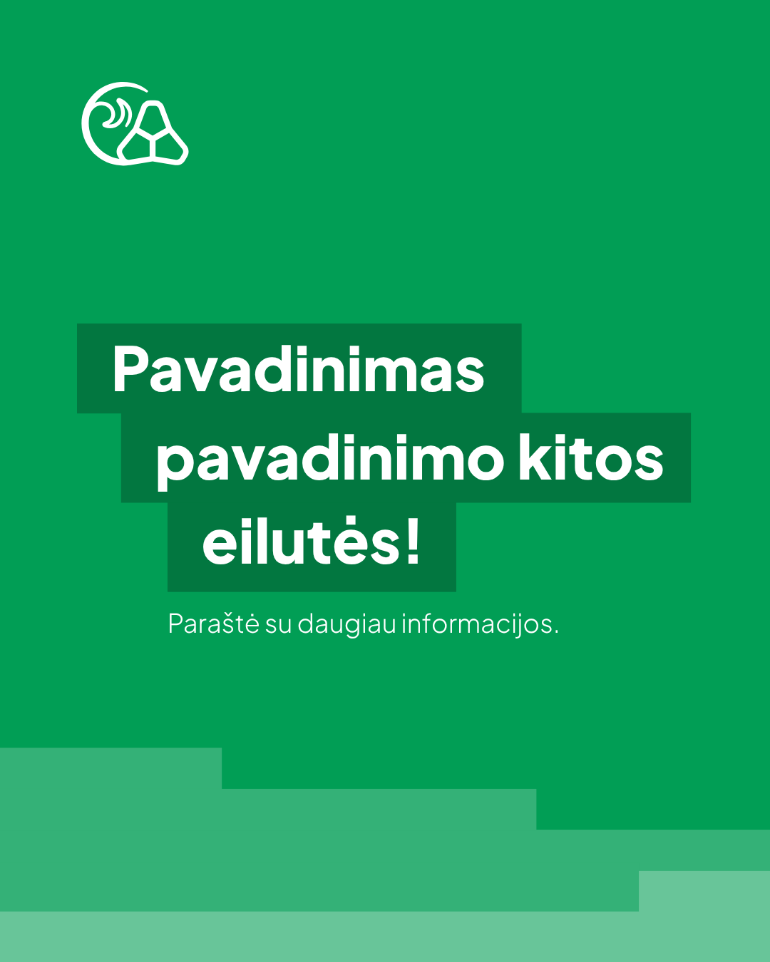
Eleven ready-made templates for Instagram and Facebook posts. Format – 1080 × 1350 px (4:5). Click on the title to download.
Photo + name


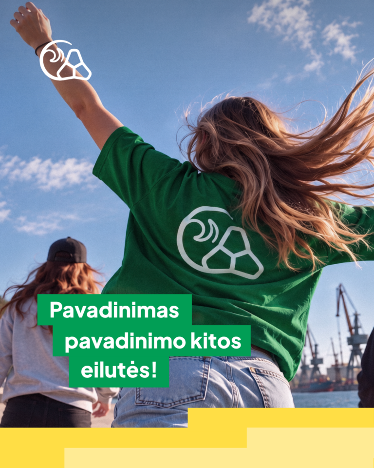
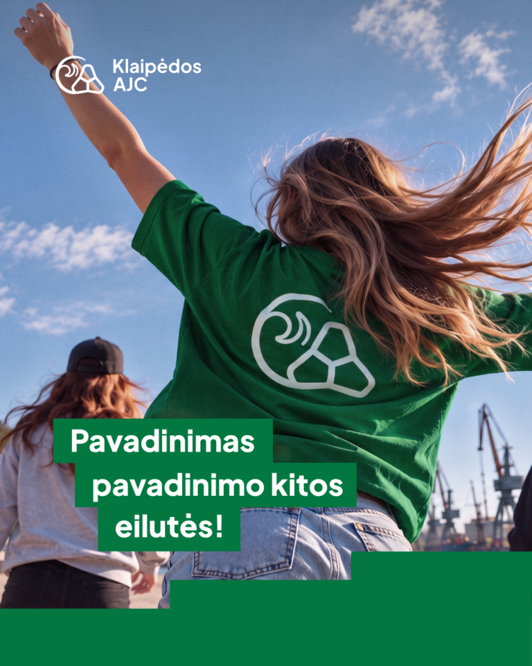
Photo + text

Text only






Information updated: 2026-10-01